Subscription costs
Add one row per month with the total you pay for subscriptions. Each step shows the month a plan started or ended.
How it’s set up
- Labels from
- Month
- Values from
- Total
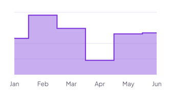
Flat steps with a light fill, so each value holds until the next label and every change is a sharp jump. Hover over the chart to see the values.
Each example puts the widget on a Notion page and lists the settings it uses.
Add one row per month with the total you pay for subscriptions. Each step shows the month a plan started or ended.
Add one row per quarter with the number of people on the team. Set Shorten to 0 so labels like Q1 2026 show in full.
Add one row per year with the monthly rent you paid. Set Shorten to 0 so each year shows in full.
The same area chart widget with a different look. Each variant has its own page.
Dashboards that show one clear trend, such as a monthly total
Short data sets where each change between labels matters
Start from the Step variant and change any part of it. Try it in your browser first, no account needed.