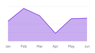
Monthly study hours
Log each study session with a Month and an Hours property. The chart adds up the hours for each month, so you see when you studied most.
How it’s set up
- Labels from
- Month
- Values from
- Hours
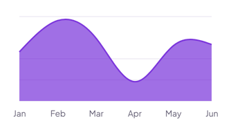
Smooth curves with a strong fill under each line, so the shape of the trend stands out. Hover over the chart to see the values for each label.
Each example puts the widget on a Notion page and lists the settings it uses.
Log each study session with a Month and an Hours property. The chart adds up the hours for each month, so you see when you studied most.
Add one row per month with an Organic and a Social property. The stacked areas show each source and the total visits.
Add one row per month with your savings balance. A highlight range marks the goal, so you can see how close each month gets.
The same area chart widget with a different look. Each variant has its own page.
Short data sets where each change between labels matters
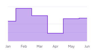
Values that change in jumps, such as prices, plans or team size
Start from the Normal variant and change any part of it. Try it in your browser first, no account needed.