Weekly running distance
Log each run with a Week and a Kilometers property. Set Shorten to 0 to show full week names, and turn on points to mark each total.
How it’s set up
- Labels from
- Week
- Values from
- Kilometers
- Shorten to
- 0
- Show points
- On
Straight lines join the values, with a lighter fill below. Each change from one label to the next shows as a clear angle. Hover over the chart to see the values.
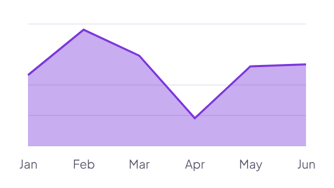
Each example puts the widget on a Notion page and lists the settings it uses.
Log each run with a Week and a Kilometers property. Set Shorten to 0 to show full week names, and turn on points to mark each total.
Leave Values from empty, and the chart counts the tickets for each weekday. The peaks show the days your team needs more cover.
Pick Income and Costs as values and set Series to Grouped. The two areas overlap, so you can see the months where costs came close to income.
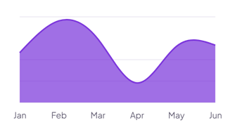
The same area chart widget with a different look. Each variant has its own page.
Dashboards that show one clear trend, such as a monthly total
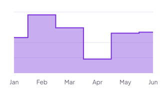
Values that change in jumps, such as prices, plans or team size
Start from the Linear variant and change any part of it. Try it in your browser first, no account needed.