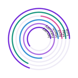
Sales by region
Add one row per order with a Region and an Amount property. Each ring adds up the sales for one region.
How it’s set up
- Labels from
- Region
- Values from
- Amount
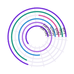
The same rings over a guide of thin circles and lines, like a target, which makes ring lengths easier to compare. Hover over a ring to see its value.
Each example puts the widget on a Notion page and lists the settings it uses.
Add one row per order with a Region and an Amount property. Each ring adds up the sales for one region.
Log each finished lesson with a Course property and leave Values from empty. The guide shows which course is behind.
Log each walk with a Team and a Kilometers property. Turn on center text with a km suffix to show the total distance.
The same radial chart widget with a different look. Each variant has its own page.
Small dashboard spaces that compare a few totals
Start from the Grid variant and change any part of it. Try it in your browser first, no account needed.