
Radial chart
Show each label in your Notion database as a ring around one center. The larger the value, the longer the ring, so you can compare a few totals in a small space.
- Notion data
- A database you connect in the editor
- Values from
- Up to twelve number properties, or a count of rows
- Rings
- One per label, longer for larger values
2 variants to start from
Pick the one closest to what you want, then change it in the editor.
Variants 1 of 2
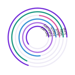 View Normal radial chart
Normal
Small dashboard spaces that compare a few totals
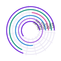 View Grid radial chart
Grid
Comparisons where readers judge ring lengths closely
Add it to Notion in three steps
Pick a variant, make the radial chart yours in the editor, then embed it in a Notion page.

Choose a widget
Browse by category or search by name, then pick the variant that suits your page.
Make it yours
Change the text, colors and settings in the editor. Connect a Notion database only when the widget needs your data.
Embed it in Notion
Copy the embed link, type /embed on your Notion page and paste the link.
More chart widgets
View all chart widgets
Make a chart widget your own
Start from any variant, connect your Notion database in the editor, change the colors and labels, and embed the chart in Notion with a link.