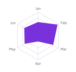
Wheel of life
Score each area of your life from 1 to 10 once a month. Set Scale to Fixed with a Maximum of 10, and the gaps show where to focus.
How it’s set up
- Labels from
- Area
- Values from
- Score
- Shorten to
- 0
- Scale
- Fixed
- Maximum
- 10
Round rings replace the straight edges of the web, which gives it a softer look. The filled shape and the labels stay the same. Hover over the shape to see each value.
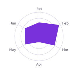
Each example puts the widget on a Notion page and lists the settings it uses.
Score each area of your life from 1 to 10 once a month. Set Scale to Fixed with a Maximum of 10, and the gaps show where to focus.
Add one row per topic with a score for the last sprint and this one. Turn on the legend to compare the two shapes.
Log each workout with a Type property and leave Values from empty. Each spoke counts the sessions of one type, so an uneven month shows.
The same radar chart widget with a different look. Each variant has its own page.
Profiles that compare several measures on one scale
Start from the Circle variant and change any part of it. Try it in your browser first, no account needed.