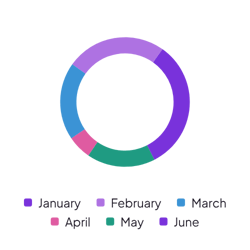
Monthly budget split
Log each expense with a Category and an Amount property. Turn on slice labels to name each category on the chart.
How it’s set up
- Labels from
- Category
- Values from
- Amount
- Show slice labels
- On
A full circle cut into colored slices, with no legend or labels around it, so the pie fills the space. Hover over a slice to see its value.

Each example puts the widget on a Notion page and lists the settings it uses.
Log each expense with a Category and an Amount property. Turn on slice labels to name each category on the chart.
Log your work with a Client and an Hours property. The slices show which client takes most of your time.
Add each answer as a row with a select property. Leave Values from empty, and each slice counts one answer.
The same pie chart widget with a different look. Each variant has its own page.
Dashboards where readers need the name of each slice
Start from the Normal variant and change any part of it. Try it in your browser first, no account needed.