Sprint burndown
Add one row per sprint day with the story points left. Straight lines between the days show how fast the work goes down.
How it’s set up
- Labels from
- Day
- Values from
- Points left
- Shorten to
- 0
- Show points
- On
Straight segments join the values, so each rise and drop between two labels is exact. Turn on points to mark every value. Hover over the chart to see the values.
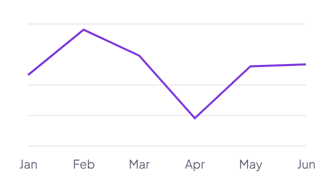
Each example puts the widget on a Notion page and lists the settings it uses.
Add one row per sprint day with the story points left. Straight lines between the days show how fast the work goes down.
Add one row per month with your subscriber count. Turn on value labels to show each count next to its point.
Add one row per practice test with your score. A highlight range from 90 to 100 marks the score you aim for.
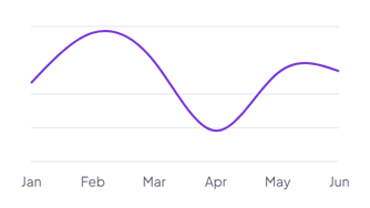
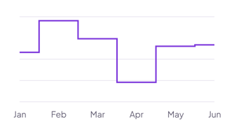
The same line chart widget with a different look. Each variant has its own page.
Trends over time and comparisons between two or three lines
Values that change in jumps, such as rates, levels or stock
Start from the Linear variant and change any part of it. Try it in your browser first, no account needed.